#IT WAS SO FUN TRYING TO MIMIC THE CHARACTER STYLE
Explore tagged Tumblr posts
Text
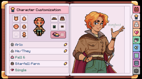
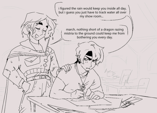
the rude blacksmith has enchanted me. also feeling so normal about this game that i did pixel art for the first time ever to try and draw my farmer in the game style
#fields of mistria#fom#fom farmer#march fom#fom march#march fields of mistria#fields of mistria fanart#IT WAS SO FUN TRYING TO MIMIC THE CHARACTER STYLE#ive been following fom development since JANUARY 2022#i signed up for email updates guys#im so happy its in ea now hehe#dev team ily its so fun im eagerly awaiting full release#im quite in love with literally all the romance candidates but im so obsessed with annoying march#that i dont think i can kid myself on who my first route is gonna be LOL#gives me an excuse to replay the game a bunch once its out :3#itseart
3K notes
·
View notes
Text
drawing something mostly lineless for the first time in a few years and i am having SO much fun
#my art was initially lineless and then one day i started lining things and had so much fun that i didn’t stop lol#but i wanted to mess around and update my old style and . i may have to draw like this more often because i’m!!!!#me trying to mimic the clone wars style and getting completely 100% derailed is pretty in character#.txt
5 notes
·
View notes
Text
oh this is DEVESTATING that webcomic i ate up when i was in 5th grade is so much more niche than I thought 😭 how to get rid of the cat head you were my lifeblood ily......
#xero says things#genuinely i had that 'selfish' cath drawing as my school account pfp HAJABSJS#i remember a few years ago i made an insta to dredge through the creator's insta and i remember some bits n pieces that weren't on webtoon#but like . bwah......#genuinely the art style and the lil weeds and the characters were a part of my soul i loved them so much......#i should draw them. or maybe try to mimic the art style. that'd be fun.....
3 notes
·
View notes
Text
Excellent analysis, I'm going to be thinking about this a lot for a while.
I want to write an actual reply to this analysis but I'm having problems with the app and both versions of the website right now so I can't take snippets or double check if my memory is faulty. UGH
"Why Would You Bother With Me?" - An Analysis of Kitsunami, 09/07/2024
tw: major discussions of abuse, the cycle of abuse, re-traumatizing situations, toxic and abusive relationships (non-romantic)

so like when I first read this panel my reaction was just to joke with Cori that this is a "get out of my school" moment (iykyk) but I've been thinking about it a lot recently because I... couldn't remember any specific beef Kit had with Tails?
Last we saw of them interacting one-on-one, Tails was talking Kit down from fighting, and Kit's beef with the squad later was more with Sonic than him. Tails didn't take down Surge in #56 or even affect the fight in any way, and Sonic was the one who told Kit that Surge was dead beforehand. At least that I could remember, so I went back to those comics. Indeed, in #56 he shows no animosity towards Tails specifically, nor when he talks to Surge in #55.
Then I went back to #54.
See, he does seem to blame Sonic entirely for the Surge death fakeout, and he thinks that Sonic is literally trying to kill her when he walks in. But he does have one (1) reaction to Tails, right at the end of the interaction.

In the previous issue, after Sonic and Tails saved his life, Kit immediately switched on his subservient personality and was desperate for any kind of validation from the hedgehog. We only see it for a few panels before he is told about Surge and sinks into a depressive state, but it's made very obvious.

And when he leaves to help?

Kit's conditioning under Starline means that he is excessively codependent on Surge– and if Surge isn't around, on anyone who is nice to him. The hypnotic repetition shown to us was "You live to support Surge. You'll do anything for her." Kit's sole purpose in life is to be a Support party member.
Kit's conditioning was to be the new Tails.
Starline wanted Surge and Kit to replace Sonic and Tails– that much was obvious from the get-go. But what was also obvious was his fundamental misunderstanding of Sonic and Tails's dynamic and how that negatively impacts Surge and Kit's relationship.


Starline completely misses the strong sibling bond that Sonic and Tails have. To him, Tails is just there to support Sonic, to provide the brains and tech that Sonic lacks, and so Kit needs to be there to support Surge in the same way. He sees it only as a business partnership, and not a mutual relationship built on trust, love, and shared experiences. Starline only saw other people as tools, so obviously he projected that onto Surge and Kit, hoping that they would immediately take up the closeness that Sonic and Tails did because, well, they served the same purpose to each other, right?


Except Surge and Kit don't have that relationship. These two children were forced into the same proximity and made to work together. They're coworkers at best, being told to act like a family.
Obviously their dynamic is super toxic, with Surge clearly holding a lot of power over Kit, but it's also clear that this isn't because Surge wants to beat on the kid. She was made to be Sonic, and so she has his arrogance (and possibly Shadow's, considering IS1 showed his image when Starline was talking about stealing abilities), but, as Boom!Sonic says, "Without any of the awesomeness to back it up." Okay, wrong, she's plenty awesome, the correct phrase is "Without the experience" and, most importantly, "without the altruism that makes Sonic Sonic." Surge wasn't programmed to like the people she saves, because that would conflict with Starline's goal to take over the world. So she's only made to be competitive and to want to best Sonic, anyone inbetween them be damned. This clashes with Kit's programming to not only be liked, but to be liked by Surge. Surge was also programmed to believe fully in herself in order to enhance the arrogant trait, and Kit was made to give her the help that she doesn't want.
To Surge, Kit represents everything holding her back. And she's not built to view him as a person, because Starline doesn't view him or her as people. Obviously this doesn't absolve her of her treatment of him, and later issues showing her getting more and more aware as she becomes more social is definitely going to impact the way she views him– or, if it doesn't make her reconsider Kit's personhood, it'll serve to make her more antagonistic for the viewer.
But the point is, Sonic trusts Tails because he knows and respects him as a person. It isn't just because Tails can help him, but because he knows Tails will. Surge, at this point in the comic, not only doesn't view Kit as a friend, she doesn't even care what he thinks or feels.


And despite the brainwashing, I don't think Kit is oblivious to this. He knows how bad their situation is, but he is so conditioned to accept it that he can't escape it whatsoever. In both fights with Tails, Tails talks him down easily because Kit doesn't want to hurt anyone. Kit only reacts violently when Surge is brought up, because he's meant to do anything she wants.
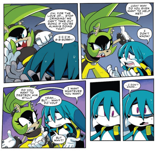

Like he said to Belle, he was made for Surge. And what he says directly after– "Sonic can use me, too." Kit doesn't even view himself as a person, only a tool– that's how far Starline's brainwashing went. It's clearly even affecting Surge, who realized in the latest issue, #72, how fast she and Kit fell into their abusive patterns again once Clutch took over– they were conditioned to be tools. Clutch claimed to want to help them, but really he was just using them for his own ends, just like Starline. So they went back to the familiar.

And speaking of familiar– pain is familiar to Kit, specifically pain in service to others. In his breakdown in #50, he says that Starline made him happy he'd been hurt. And in Imposter Syndrome #3 and #4, we see that him and Surge hate Starline and want to usurp him... but also are still trapped in the patterns he implanted in them. Surge still wants to kill Sonic and outperform everyone else. Kit still can't do anything but what she wants, to the point he becomes near catatonic when he believes she's dead.
Another pattern Kit is still trapped in is the idea that he has to be okay with his own suffering.

The only sense of home or family Surge and Kit have is in each other, but they fundamentally can't work together, at least as they are currently. Kit is expected to take Surge's anger, and Surge isn't expected to treat him like his own person.
And this, I think, is Kit's problem with Tails.
He was made to be Tails, and he knows this, but he can never have what Tails has. He can never live up to Tails and do what Tails can do, despite that being his entire life's purpose.
He doesn't hate Tails because he was programmed to– as he says to Surge, he only wants to destroy Sonic because she wants to. When he first encounters Tails, he refers to him as his target- a simple, unemotional term. He doesn't have the deep ingrained hatred for him that Surge does for Sonic.
Instead, he hates Tails because of what he sees in him. He sees Sonic and Tails interact, he sees how much Sonic trusts and relies on Tails, and he sees how he also loves and respects him. He sees how Tails has his own motivations and opinions, and he's experienced Tails's genuine compassion that was in part fostered by the hedgehog that raised him. In turn, Tails is loyal to Sonic, but not because he has to be– because he, in turn, loves Sonic and wants to be with him.
Kit only wants to be with Surge because he was forced to. Starline wanted to use Surge and Kit to stop Sonic and Eggman's cycle, but he made a whole new one instead. Kit is trapped in a cycle of pain, knows he's trapped in it, and is helpless to escape it.
Tails isn't, and Kit sees that in Tails. Subconsciously, he sees Tails and only sees how he fails to live up to his life's mission, and how he'll never have what Tails has.
After all, why would anyone bother with him? They already have Tails.
Is he a target? I like it here now.
#there's a lot to be said about Kitsunami having beef with Tails#the execution of it so far in the comic has been mixed. I get what they're going for but there's a lot of connective tissue missing#TBF the whole “sonic said surge was dead” thing felt forced at the time so some the the connective tissue that IS there is also kinda shaky#I like what they've been trying to set up cuz it's nice to give Tails his own rival for once. Especially a “Shadow” styled dark reflection#I think part of my problem with the execution with this is that it's currently being leashed to the demands of the plot#They need the plot to go a certain way but some of the steps they take to get there don't feel organic if that makes sense#TBF that could also be me wanting a some character focus#As fun as the whole “big arc with big villain” thing can be bouncing from one to the next like they have#isn't putting meat on the proverbial bones that we already have#I kind of want a breather arc that's focused on having the characters interact for that purpose TBH#Let's see Surge actually working under the Restoration instead of pulling the trigger on revealing her and Kit as double agents so soon#Put Kit and Tails into situations where they have an actual dialogue going as rivals/peers#Hell what about a single issue from Duo's perspective where we see what Mimic does on a regular day in that form.#Maybe give us some stories where Lanolin can actually bond with Tangle and Whisper seperately#I guess I was determined to stick a wall of text in here somewhere huh xD
367 notes
·
View notes
Text
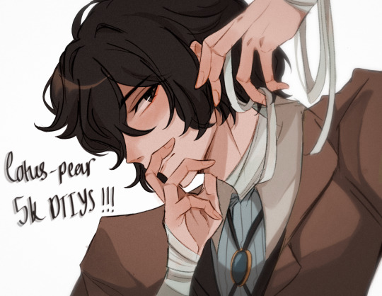
YAAAAAYYYY ITS FINALLY HERE!!! ty guys sm again for 5k i rly appreciate it <3
rules and guidelines under the cut!
rules and due date (i've never done this before so bear w me ok!!):
-due date will be march 1st! i will accept entries a few days late dw i'm nor ur professor or smth BUT I WOULD RLY PREFER IF U GET IT DONE BY THEN (just dm me if u need more time)
-pls tag ur finished piece under #lotuspear5kdtiys and dont forget to mention my user @lotus-pear! if i neglect to reblog ur piece then pls lmk even though that probably won't happen bc i'll be checking that tag every day for new entries👹
-pls don't trace the art.. i'll be really sad if u do that :(((( if u need help at all w the posing or hands then shoot me an ask or weed ur way into my dms bc ik this is kind of a complicated piece
-anyone can participate!! u don't have to be following me or anything and it's fine if we've never interacted before
-colors and expression are completely flexible and i'd even encourage playing around w it since the final product isn't meant to mimic my style. if u can then pls try to keep the pose relatively similar although i don't mind if it's changed a little bit. whatever is most comfortable to u as the artist.
-if u guys want to see the piece without any shading or rendering then pls dm me, ik it might be easier for some ppl to just see the bare sketch or the lineart w base colors
prizes🤩 (ik this is what u guys are rly after /j):
-alr so ik everybody's all like "well what's in this for me🤨" oh my god if u would just let me explain 😐 i'll be choosing three winners and two honorable mentions amongst all the contestants
-the top three winners get a follow (yea ok kinda sucky but wtv) AND they get to commission a fully rendered piece from me of a single character of their choice for free >:) (i'll discuss the details w the winners in two months)
-the two runner ups will also get a follow from me AND they get to commission a sketch of a single character from me (again, i'll discuss what this entails in further detail when the honorable mentions are selected in two months)
————
ermmm yea i think thats it for now i'll come back and edit the post if i feel the need to add anything.. HAVE FUN GUYS I CANT WAIT TO SEE WHAT U GUYS DO🫶🏼🫶🏼
1K notes
·
View notes
Text
For any nonhumans struggling with species dysphoria, I want to help you all as much as I can. I've been experiencing it all week. It can be quite exhausting and put you in a lot of distress, in my case. X(
Here are some tips I'd recommend to help:
1. Mimic the diet of your kintype/theriotype. You are a shark? Eat seafood. A dragon? Maybe try to burn some food a little (or turn it black like my own preference if you want). You kin a character from [Insert source]? Try recreating foods/dishes from their world or dimension.
2. Listen to relatable music. I'd recommend making a playlist of any songs that feel species affirming/euphoric, or even echo that dysphoria further, therefore turning it relatable. (Few of my favorites are Bones by Imagine Dragons, Control by Halsey, Ancient Dreams in a Modern Land by MARINA, Momento Mori by Fish in a Birdcage, among other songs that feel therian coded to me).
3. Do vocals. Howling, barking, screeching, or roaring are very relieving if you are in the correct space to do them! If you are in a quite space or do not want to out yourself to anyone, try purring, growling, hissing, or other unnoticeable sounds. You have an object kintype? Mimic the sounds of the object, like beeping, clicking, etc. (I personally make microwave sounds just because it is fun). Recite voice lines of your kintype from the source they are in. Mimic their voice and volume to match.
4. Move and physically act like your kintype/theriotype. Quadrobics, mimic the flapping of wings, walk bidepedally, whatever you do, turn your mannerisms and motion to reflect your kintype/theriotype.
5. Dress like your kintype/theriotype. Is your kintype a character? Cosplay them, or mimic their clothing style, clothing color, hairstyle, etc. If they have tattoos, scars, or patterns on their body, copy them on your physical form with paint or pens. (PLEASE USE NON TOXIC MATERIALS. STUFF SAFE FOR YOUR HUMAN SKIN.) Are you a species of animal(s)? Dress in your species' colors, or, once again, paint or color yourself like it/them. Are you perhaps any other form of creature or object? You can use the same tips as the others, and another idea that works for all is that you can buy costume pieces of your kintype/theriotype. Masks, headbands, just normal clothing in general, the options really are infinite.
6. Express your dysphoria through artwork. I love doing art when I am heavily species dysphoric. Drawing, crafting masks, origami, painting, collages, all are forms of art. If you are skilled in music, then you could even create some songs of your own!
7. Go out and explore nature. This one is mainly targeted towards therians, whose types are grounded on the life on earth rather than other dimensions or universes, but just like the other methods, it can be universally used by any types of nonhumans. Collecting things is my favorite way of exploring nature. Collect rocks, shells, sticks, leaves, bugs, plants, anything that makes you feel more comfortable in your own (unfortunate) physical body. Stay grounded in the world around you and you may find the dysphoria slips away. Hiking and going on short walks can also help, building a den, smelling the scents of the outdoors. All great ideas that I personally recommend.
8. Write about your feelings. Whether you are good at expressing yourself through poetry, you keep a diary/journal, or you can project onto OCs for new backstory lore like I do, writing can truly help with any dysphoria. Not only that, but it is sometimes refreshing to come back later and read about what you were feeling before. It can serve as a great reminder that you are a powerful being and you will always overcome the feelings if you try.
9. Research about your kintype/theriotype. It does not matter if you are an animal, concept, or object from earth, a being from fantasy, or a character from the greatest book or show, you learn something new every day. So why not learn about yourself? Read books or watch animal documentaries of your theriotype(s), same thing for you otherkins and your fantasy species. Fictionkins can look up facts about themself as a character, their book, show, game, etc.
10. Talk and interact with other alterhumans/nonhumans. Remember, we are a community, and while you are experiencing horrible episodes of species dysphoria, there are many other beings going through the exact same thing at the exact same time. So why not talk to them about it? Share your experiences, help eachother cope, you may even connect with more individuals that way, building more relationships with others and meeting new beings.
11. Past life meditation. If you are a nonhuman who has a past life/lives, you may find comfort in meditation, where you can truly tap into what you once were, and still are in this life as well. Look to the forgotten, and turn in to remembered. Open up your past and live over again.
12. Listen to sounds. Nature sounds, voices of other characters you know from your world, vocals or sound effects of your kintype. These are all good options to turn to if you want to feel at ease with yourself.
13. Let your emotions out. Sometimes this is all you really need to do when species dysphoria hits hard. Cry, bite things, claw at pillows, LET IT OUT. There is absolutely no problem in being yourself and expressing your heavy emotions in your own, unique, nonhuman way. You may find you feel much better after.
That's all I've got, but I hope whoever/whatever reads this far has an amazing day/night. You are an amazing being, thank you for embracing yourself and living authentically. <3
#therian#therian community#therianthropy#alterhumanity#alterhuman#alterhuman community#fictionkin#objectkin#conceptkin#nonhuman#species dysphoria#otherkin#otherkin community#otherkinity
386 notes
·
View notes
Note
What a about Caliborn makes him so cool in your opinion?
Go keep track of his progression as an artist alongside his development as a character and think about how these are intrinsically linked. Ponder the fact that he is both at his most obnoxious and at his most amateur when trying to ignore his unique style explicitly brought on by his canonical learning disability and mimic others rather than truly be himself. Consider how his explorations of art are genuinely cool, not a bad thing, and how we get some really neat multimedia stuff out of it.
Caliborn may be a shitty little teenage wretch but the way he is portrayed as an artist and as a disabled person is both really good and very real. It comes from a place of love. His learning disability is handled with a degree of gentle care that you would not really expect from Hussie. The place Caliborn's art style ends up in is so fucking sick and I actually unironically love it. The technique he uses is really interesting. It's intentionally reminiscent of an Etch-a-Sketch, and I'm a little obsessed with it.
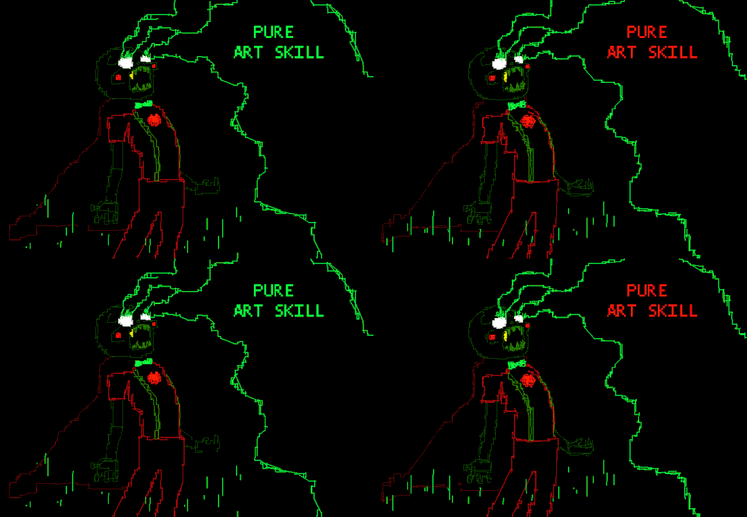
This is so fucking good. I mean this seriously. He's right - that is some Pure Art Skill.
I just love the way art is employed as a necessary component of his character arc. It's so neat. You don't see visual cues that intricate too often. Usually it's just in character design, but watching his entire art style and even his medium of choice change several times over is fascinating. You can really tell Hussie had a lot of fun with him. He's also just really, really fucking funny. Just about every sentence that comes out of his mouth is Grade A Absolute Fucking Gold, and I'm honestly obsessed with his dynamic with Dirk. This may get me thrown to the wolves, but I personally think Dirk and Caliborn have way more chemistry than Dirk and Jake. Maybe that's because we actually see Dirk and Caliborn interact on screen... Lmao.
Necessary Topic: I don't know why people hate him so much. Like, I understand hating his misogyny and fatphobia, sure, but those are deliberate character points and not just Hussie-isms. I see people act like Caliborn is indicative of Hussie, as if Homestuck-era Hussie wasn't, like, famously really fucking good at writing female characters and absolutely not a misogynist. Caliborn's a parody of Homestuck Anti-Fans - which is a term we really ought to bring back, god, anti-fans are absolutely still a thing and good lord they're everywhere - who really were just shitty little bigoted haters. Calliope, the opposite side of his coin, was representative of, essentially, "the best kind of Homestuck fan" - an ultimately sweet young teen girl who willingly dedicates almost all of her time to this piece of fiction she loves so, so much, who draws a lot of fan art for the joy of it all, has OCs that don't fit any of the design conventions in Homestuck whom she pairs with the characters in it for innocent fun. Someone who has a lot of theories and analyses, writes a lot of fanfic, and is genuinely just having a lot of fun. Everyone loves Calliope. Even the characters in Homestuck love Calliope. They just think she's the cutest, sweetest little thing they ever did see. Caliborn was the worst kind. He sucks on purpose. No one likes him. He is a total nuisance to characters he is by all means trying to impress. I love them both.
It's also just funny that he's a canonical Intersex Transmasc who is probably Gay and this has, like, no relevance to anything about him, really. So no one really talks about it. Gender Hilarious, Gender Nefarious.
#homestuck#homestuck meta#homestuck analysis#cherubs#homestuck cherubs#caliborn#calliope#caliborn.pdf#nekro.pdf#nekro.sms
223 notes
·
View notes
Note
I'm honestly amazed by how well you can imitate the LO S3 art style! Have you always been good at this sort of thing or is it a skill you developed due to your work as a tattoo artist?
ahhh thank you, but ima let you in on a little trade secret -
it's literally just referencing LMAO which is a valuable skillset to have! but one that I think a lot of folks tend to overlook because they think "learning to draw" means "I need to be able to draw everything perfectly from imagination!" Which sure, learning how to draw things without needing references might be cool, but it's ultimately not the sole defining feature of a "good artist" and I think there's frankly way too much emphasis put on "drawing without references" these days because it creates this unrealistic expectation of what an artist is. Referencing is part of the process! It's important! And it's a valuable skill to have so that you can actually grow your skills beyond your own limits! Referencing is as important to the process of creating art as research is to the process of writing, you can only produce so much new stuff if you're not taking in new stuff alongside it.
Though I use this skill a lot in tattooing as well, it's mostly rooted in my animation schooling which broke me out of the habit of drawing purely from imagination and taught me how to properly reference other material for educational purposes.
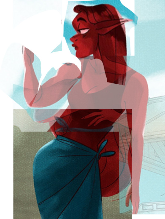
And I'm sure there are people in audience right now gasping at the fact that I simply cropped a bunch of different shots of Minthe from S3 and rearranged them like some surgical madman playing with body parts-
-but this is like, the actual majority of the process when it comes to learning other art styles and this process is taught as a skill in a lot of art schools because it forces you to draw what's there rather than what you think is there. This is the basis of master studies, to learn the techniques of other artists by trying to mimic them as closely as possible. Don't know what tools that artist used specifically? Try to recreate the work anyways with your best guess. Even if you only get close but not perfect, you'll still likely learn a lot along the way and may even develop some brand NEW techniques that weren't present in the original work you're studying from.
Imagination is necessary to the creative process, but it's only part of that process, you can't suddenly learn how to draw the way other artists draw through imagination alone because your imagination is limited purely by your own lived experiences. Our brains don't come pre-installed with these skills, they can't just magically unlock the capability to "do the thing". Just like how we have to learn to follow recipes as a means to becoming a baker or learn to read the alphabet to learn how to read and write, we have to learn how to draw what we see and reference the material around us if we truly want to expand our own innermost knowledge which will allow us to draw from imagination.
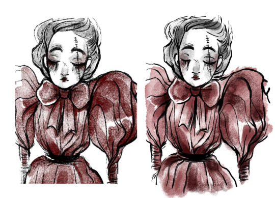
Here are some other examples of studies I've done, such as my attempts to learn the art style of The Doctor Foxglove Show:
As well as a background study from S1 of LO:
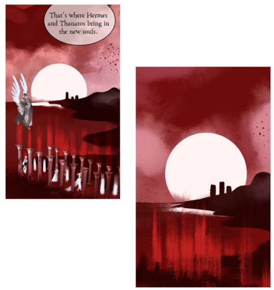
And of course here are a handful of the shitloads of studies I've done to try and "figure out" how to draw Hades and Persephone from S1 of LO:
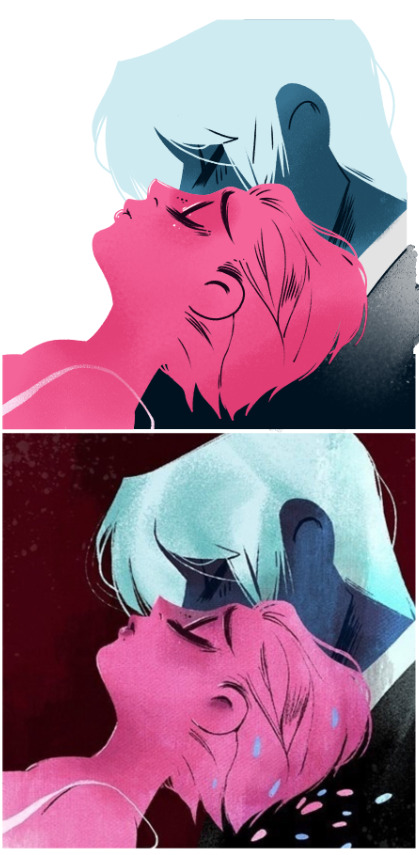
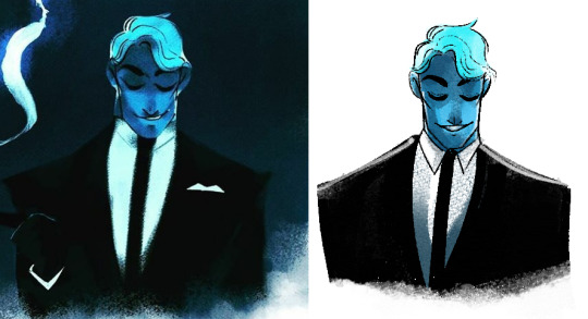
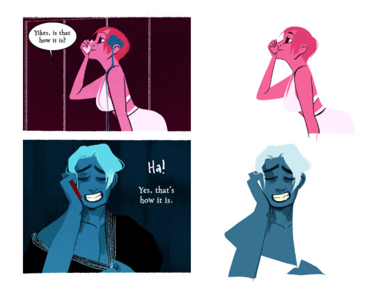
Aaaand just for the fun of it, here are some completely non-LO studies, like the ones I did of Kazuma Koda's background work and Akihiko Yoshida's character designs for Nier: Automata:
And this sorta rotoscoped ??? animatic of Mitsuhiro doing the opening jig for Still Feel by Half Alive which is 100% not done and probably never will be LOL
I'm always progressively doing studies of both LO and other media in this way so that I can update my knowledge and continue to improve my skillset.
Though, despite my best efforts to mimic the original creator's style, works like Rekindled will always have my own stylizations present, as that's just an inevitable consequence of it being made by myself and Banshriek (and the fact that we just refuse to draw worse to look more like LO because jfc so much of LO's original art, even the stuff we love, is rooted in Rachel's trial and errors lmao), but that's a feature, not a bug :') <3
So the answer is yes, the Minthe S3 redraw was done through skills I developed over time, though not necessarily through tattooing, simply through learning how to actually practice properly beyond "drawing a lot". And you can too! Draw lots, but also remember that your brain isn't naturally just going to "get better" at whatever you're trying to achieve just because you really want to achieve it. I try to avoid the mantra of "just practice" because it oversimplifies what's truly necessary to learning - having something to learn from outside of your own imagination. If you don't learn how to practice properly, then you'll just wind up repeating the same mistakes and reinforcing the same bad habits over and over again.
All that's to say, if you want to learn how to draw like a certain artist, try and recreate their art for yourself ;0 (but like also please for the love of god remember that it's for EDUCATIONAL PURPOSES, I shouldn't have to tell y'all not to copy directly off other artists' work for your own because that's just deadass stealing lmao) I know this enters the ethical dilemma of tracing, and whether or not it's a "valid" way to learn, but there's a lot of virtue in learning through referencing other artists and building new skills through them. I'm sure folks will argue that it's a 'crutch' or 'training wheels', but that's all often being touted from the perspective that crutches and training wheels... are automatically bad things and aren't meant to help people ?
Like obviously if you want to create your own thing that isn't purely "living in the shadow" of the works that inspired you, you WILL have to make that leap into the unknown. But that leap's a lot less scary to make when you have a parachute.
#sorry this turned into a long art advice post LMAO#but i hope it's helpful!#ask me anything#ama#anon ama#anon ask me anything
95 notes
·
View notes
Text
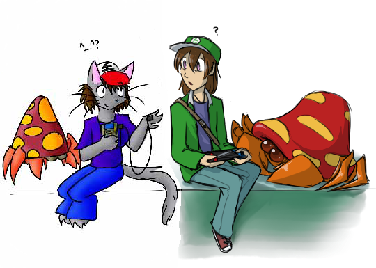
I was cleaning up some broken links on my old silly Pokemon fansite, the Neglected Pokemon Lovers Unite (NPLU), and I realized that it has now been open for 25 years. TWENTY. FIVE. YEARS. That is an ASTONISHING amount of time for a site to stay open! Even if the last substantial update was like back in 2009 lol. The world around it has changed so much, but I think it's still valuable as a time capsule of a certain time on the internet. I wrote up a new essay about it on the site and did some general clean-up here and there.
Anyway to that end, since so much of the fic and art there is so old, I decided to compare Radic's oldest form to his newest! Radic was always a human boy but I just couldn't draw humans at the time so I made him a furry lol. Eventually I figured it out.
I also thought it'd be a neat challenge to mimic my own style back when it was really wonky and bad. And it was! It was kind of fun actually. I don't have too many shots of Radic from back then (it was hard to get art on the internet in the late 90's-early 00's), but I do have a few - hugging Kitsune, two old kiribans if you want to compare. I had a lot more old shots of Parasects though to reference unsurprisingly, they were very triangular lol. I think I did a pretty good job of matching what my art used to look like. I had a clear see-through Gameboy back in the day if you can't tell what Radic is holding lol.
("Isn't Radic the faceless avatar of your gamer self as depicted in Handplates-" yes, but Pokemon!Radic is the only one that actually became his own character, all the rest are shells)
If you do go poking around the NPLU, please keep in mind that almost everything there is very old and most of the fic and art is pretty bad (and shockingly violent). Plz do not judge me! My younger self was a cringey weeb but she was trying very hard. :<
[patreon]
#pokemon#z art#radic#callima#parasect#man i haven't drawn a parasect in ages i forgot how fun it is#my crabshroom babies#i always get tempted to just delete all the links to my old art but people always tell me not to#they like seeing it?? which always baffles me but i'm trying to accept that there's something worthwhile about them lol#radic is blind so he's not using the switch he's just holding it#maybe for red? idk#there was this odd stretch where i was using dot eyes#then switched to big anime eyes#then smaller anime eyes#then back to dots again#time is a circle...#i also used to use ^_^ CONSTANTLY#thus the ^_^ by old radic there#i've seen a lot of old web trends get revived but not hit awards/kiribans#for some reason#hit counters sure webring sure affiliates sure awards and adoptables sure#but celebratory things for reaching a hit marker? haven't seen a lot of those lately
218 notes
·
View notes
Text
(My Youtube comment repost from Martyn's latest Wild Life ep | BEWARE SPOILERS)
I'm drafting this comment in my notes app because I loved this episode SO much and I need to explain why bit by bit:
Oh. my GOD that wildcard was so so fun, I can't believe so many powers fit people perfectly. This season has been so much fun, it really lives up to the name, and I think that everyone trying to figure out the wildcards or working around them or with them (like with the powers) has made the season feel closer almost? It feels like everyone was interacting with each other and it was a delight (or like maybe it's just Martyn pov, I've seen people say "watch Martynpov cuz he gets in everyone's business so you can basically figure out all the povs from his" LOL)
The My Hero Academia take on this. Oh my GODDD I'M SUCH A SUCKER FOR ADAPTING STYLES AND FORMATS FROM ONE MEDIA TO ANOTHER. It's my favourite thing EVERR and this was SUCH a good application of this, matched the theme perfectly. Cherri if you're reading this I love you and the art was amazing I had to pause and look at each character eyecatcher. AND THE CHOICE OF DOING THE ADS WAS GREAT ohhhhh the addition of the trivia bot was genius, I loved the callback to that wildcard.
I'm sorry for yapping too much but I just. Love creativity and artistry and this was packed with it- on top of all the fun that the life series inherently carries. This episode was so fun and lively and the intermission screens and ads transformed it into something else too, you could tell what it was trying to mimic yet it still felt very in-style for a Martyn video- I think cuz those are also just brimming with creativity. Love that there's just no shame or fear on going a bit off the script or off style for the sake or making something different or making a vision come true.
TDLR: I'm crazy this was amazing and it was SUCH a season finale, ty :D I'm really in awe about how creative you gotta be to pull stuff like this off, hats off to Martyn
#inthelittlewood#wild life smp#wild life spoilers#trafficblr#god. god i hadn't had so much fun in a while#also like i almost cried cuz that was so fun and idk the joy got to me ok it got me#ghast.post#ghast.speaks
52 notes
·
View notes
Note
Do you have any tips on for people starting a comic and wanting to post to tumblr? Like pacing ect. Or well any experience you’ve had with your comics? Love your content as well ❤��
If it’s simply for fun, and you’re just trying to gain experience, my biggest advice would be to just START. Don’t worry about it looking perfect. Don’t worry about comparing it to other’s comics. Just try something, and if you find it’s not working, you can always change things up. I have gone through several styles and page layouts since starting. Do I wish those first pages of EW looked just like what I’m doing now? Yes, but if I’d waited around for perfection I would have never started. And I wouldn’t have had nearly as much fun creating it! If people like it, that’s great, but your art is for you. If you’re growing and learning and having fun, then you’ve accomplished something!
Now for some less preachy advice 😂…
—If your comic is gonna be hosted on Tumblr specifically, I would say, make sure you keep the 10 image limit in the back of your mind when you’re pacing things. That can definitely cause some headaches down the line. If you don’t plan ahead, and end up hitting it, you’ll have a sudden cut in your flow. This last update I knew it was gonna be long, so while I did plan, but I could’ve planned better.
—Variety is key!!!!!
Composition changes keep your viewers from getting bored. Sometimes I’ll find myself falling back into the bad habit of just doing the simple back and forth with two characters talking straight on, but changing the camera angle, making establishing shots when you change locations, and over the shoulder shots, etc etc…All these will make for a more interesting viewing. You may think a character needs to be in every single panel to make it interesting, but if you have a lot of dialogue, a simple plain shot—either in top of a solid background, or just over something boring, like a glance at the set, etc—this will let people focus on the words rather than splitting their focus.
Variety applies to shading as well—whether you’re using color or black/white. Variety in values are SO important for comics. You’re shoving a ton of information in a limited space, so try to keep your values different for items that are close together….it can make things very confusing and turn your line work into indistinguishable blobs if you shade without this in mind.
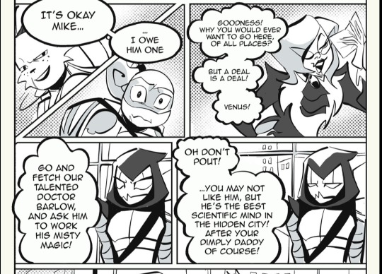
(Using this panel as an example….)
The top two panels have a variety of darker values and a halftone background—so the next two with Venus, I kept rather simple. I could’ve colored the buildings behind her, but then, she might’ve gotten lost amidst all the grey. There’s not really any trick or solid rule to this, but once you develop your creative eye, you’ll make these choices without even thinking about it.
A few links to helpful tools (they’re all procreate centered I’m afraid 😅)
Outline brush — a free tutorial for Procreate users. This brush kinda mimics the CPS feature that lets you create panels with a nice black outline. I used this brush very often, and it really gives your panels a professional look. Fair warning, it can be glitchy, but it’s free…
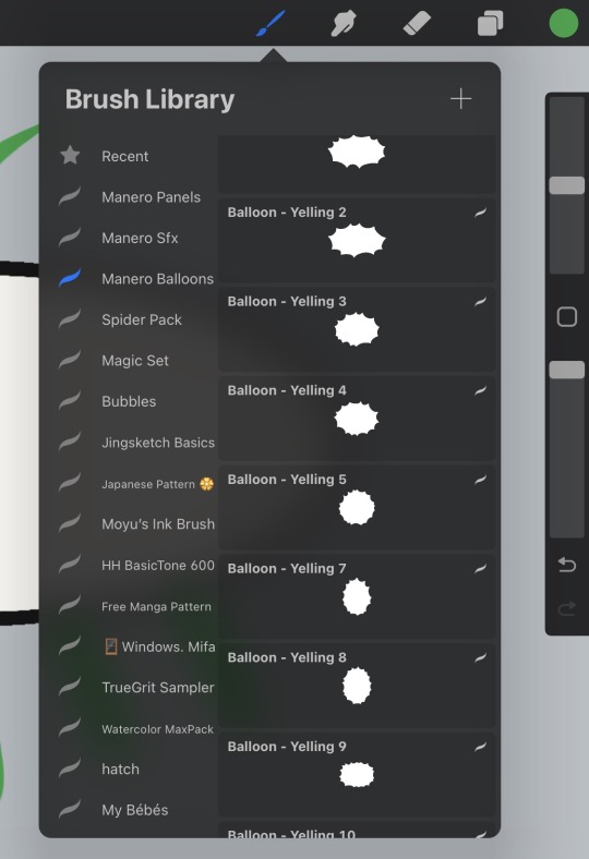
Manero Comic Bubbles and sfx — These brushes are not free, so I would recommend maybe getting in your groove before you try them out. They’re by no means necessary, but I’ve just started using them, and they save me so much time. There’s a HUGE selection of shapes, and they go on with a solid white background, so you don’t have to worry about coloring around your dialogue balloons.

#rottmnt#ask slushie#slushie rambles#I could probably think of more stuff but my brain is fried I’m just really putting the rambling in that slushie rambles tag#art tips#slushie faq
259 notes
·
View notes
Text
Here ye here ye, another breaking down processes post from yours truly!
For this animation, my plan was to make something I'm proud of AND also something to force me to take my time since with all previous animation works they were all rushed. I normally tend to speed through work as someone whose illustrations are painterly and I like to keep them rough. Also lets be totally honest my other plan for this animation was to animate Mizrox being so sickeningly sweet.
Fun fact, this animation was going to be longer. I had tried to plan out Olrox climbing on top of Mizrak during the kiss to lay on his chest. There was an attempt trying to rough that out and several ref videos It was scrapped because for the life of me I could not figure it out. Also hypothetically if I was going to keep it, I would cut to another angle (perhaps Mizrak's face close up) and then cut to another angle that would make it easier to see that climbing over the top. OR, consider Olrox already sleeping on his chest (im just rambling now but this is basically 'if you were able to do this again' section).
I wish I actually went through a more proper tie-down process because the jump from going from my rough straight to clean was rough (badum tsk) for the first few seconds. Defintely learnt my lesson ALSO Olrox is surprisingly really fun to draw from behind.
I challenged myself to see if I could get the idea of "bigger movements, less in-betweens, smaller/slower movements, more in-betweens." Though the effect of Olrox rubbing his face against his arm may be a little too jarring and I steered quite a bit away from my rough and self-reference video in hopes of making the face rubbing more apparent because I thought the character acting was too subtle and wanted a contrast to the other half of the scene. I reconfigured my CSP animation workspace for this too so it definitely made the process less tedious when cleaning up the animation.
(Which by the way I do record a lot of self-references depending on the section! For things I can't do/uncomfortable doing, I'll end up looking up videos. It's the easiest for me to catch subtle things in body language and also get a feels for the motion.)
Also I'm really satisfied with Olrox's anticipation before his smooch and the shoulder roll at the end even though technically the arc doesn't complete itself. MIZRAK THOUGH, when cleaning up I realised my rough wouldn't make sense because he's already looking at him so there's no need for a turn, and then the lack of a shoulder movement felt jarring, so all of that was done without any thought, wish I did think about it more though.

Now compositing was a monster in its own right and basically me jumping back and forth between turning on and off different layers, but here are all the new things I did; I duplicated and blurred the lines of the lineart, beveled the shadows so it was lighter on the inside, and added a rim of blur so the focus drew towards the couple. Also will absolutely admit that my fanboy ass went "... be crazy and try to mimic the show." The final did not go that route because I thought it was more important to emphasize the mood/atmosphere (Also Olrox is intentionally stylized differently because i wanted him to be softer here and I had to give him eye highlights for plot HELP). THOUGH to say I did not try to mimic the style, the #2 lighting test was my 'attempt' LOL 😭 I can never consume media normally.
Here are the lighting tests I went through. I definitely knew I wanted to go with a morning vibe, though I tested out a night ver for fun and did some edge lighting which led to mixing both version #2 and #3 to make #4.
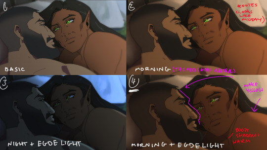
Fun fact, I almost went with #2 due to fear of getting too heavy-handed with compositing and therefore losing the animation (even though I really liked #4 at the time). Thanks to a friend, they also shared the sentiment of liking #4, though pointed out it felt like midday and encouraged me to make the colours warmer and deepen the shadows. It is a really tough balance but I think for a softer scene like this, the more additional layers of comp worked out in the end.
The edge light was a last minute thing because someone told me to add sound and to have light stream in. Also at this point I deadass forgot that you know, Olrox, is a vampire, but hey rule of cute overrules. We can pretend its light not from the sun LOL

Also yay I got to show off my own style a tad, I love paintingggg. It's not as completely fully rendered coz I knew that it would get covered up but I still made sure it was quite clean regardless. I didn't realise how much of it would be covered up even though I did make sure they would fit/make sense for bg LOL
Now we are done!
If you've gotten this far thank you! There's gonna be less frequency of these animations due to the semester starting back up soon and I don't get many opportunities to actually 2D animate (despite it being an animation degree RAH). Also I remembering cringing and laughing a lot when I immediately started putting colour down going "oh i can see the end of the horizon, i have too much power as an artist, people will see this i cant let them see me be crazy"

[Here's some memes I drew over while my friend was reviewing my work]
#mystery talks#castlevania nocturne#artists on tumblr#castlevania#castlevania fanart#fan animation#olrox/mizrak#i still keep going “oh no people who worked on the show will see this theyre gonna see im insane /lh”#its ok coz being crazy pushes you to achieve things
86 notes
·
View notes
Note
Your addition about Tevinter fashion was so interesting that I can't help but ask (and my apologies if it was something you spoke about before but I missed) — what are your favorite bits of fashion details in Veilguard? Doesn't have to be just Tevinter :)
This is so sweet?? Thank you!! I'm honestly always about 0.5 seconds from rambling about this stuff at any given moment, but I rein it in mostly.
I've talked about Neve a little on here, mostly in the tags on other posts. This post by @icescrabblerjerky talks about Neve's fascinators and how they're inspired by old noir detectives, and I talked a bit in the tags about how her collar in that same outfit mimics the upturned trench-coat collar also associated with old-timey detectives (Sherlock is the most famous example I can think of). The outfit we first meet her in is also very much trench-coat-adjacent imo.
I will try not to go overboard here but !! Some of my fave other little details!
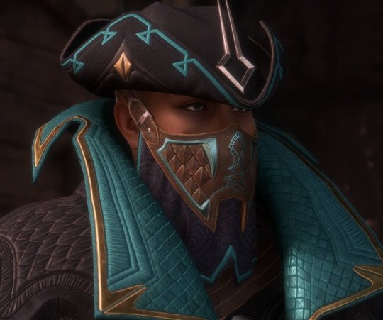
The Viper's hat! It's a tricorn-- always fun! BUT it works really well here, especially, because actual vipers have triangular-shaped heads? (I am not a snake expert and I believe there are exceptions? But generally) Also-- the little diamonds on the sides of the hat look like snake eyes? And the arrow-sort-of shape in the centre seems like it could be a nod to adders- which are a kind of viper. They have an arrow-like shape on the top of their head! Essentially, this man not only gave himself a cool nickname, but he is literally wearing the Thedas equivalent of a Batman outfit. He fully committed to the aesthetic, and I love him for that tbh.

Emmrich's coat is designed to mimic a ribcage! And not just here- this motif pops up in both of his Hero of the Veilguard armour sets, as well! I also noticed in his cosplay guide that this first outfit we see him in has a sort of waist-chain (more on that in a sec!!) with a gold tailbone that sits above where his real one would be?

And of course there are little skulls all over him, too. It's very reminiscent of the memento mori movement- 'remember you must die'. Historically, this was a way of coping with the inevitability of death in a world without a lot of the scientific advancement we have today. Death was a part of everyday life, even more so than it is for most of us today, but it was still scary. So people made art about it! And jewellery! And songs! As a way to cope with it all, and also sometimes as a way to remember lost loved ones. To have Emmrich, who is afraid of death, embrace this idea in his fashion is just... chef's kiss, honestly. Because it was always a way of trying to face death head-on? And acknowledge it, and make it hopefully feel a bit less terrifying.
Although Emmrich's overall style is very Victorian-inspired (the silhouette, the waistcoat, the chains etc.) a lot of his jewellery actually seems reminiscent of older memento mori pieces? There are some examples held by the V&A Museum that date back as far as the 16th Century that I could see him wearing. It's a really nice touch if that is indeed the inspo, because the Mourn Watch pride themselves as keepers of history. So to wear jewellery like this every day, an eclectic mix of time periods, all tied together by this single thread of remember you must die? It's so incredibly fitting for them!!
Also re. the waist-chain. I'm referring to it as that instead of a belt because to me it looks like the kind of thing you'd hang a pocket-watch on? The looping style is very similar. It's of course a lot bigger, but I think it might've influenced it?
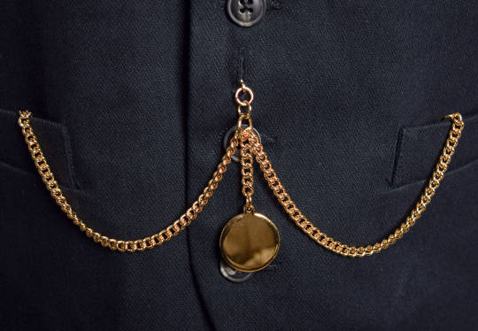
This has gotten really long so I'll stop now, but please know there are a hundred little things I haven't even touched on! So much care was clearly put into each and every character's design, and it brings me so much joy!
#thank you so much for this !!! It's not often I get to mash 2 of my loves (video games & fashion history) together like this!!!#(and also Batman is in there too ig?)#I had fun with it :')#emmrich volkarin#the viper#veilguard spoilers#dragon age: the veilguard spoilers#da:tv spoilers
48 notes
·
View notes
Note
How much of an impact has writing and consuming fanfiction had in your writing career?
I ask about fanfiction specifically because it's such an open communication sort of media, it's so easy for author and reader to interact. Do you think you'd write differently if you'd never been in the Fanfiction community? What do you think has carried over from those works and interactions into your current works?
ooh, such a fun question! I've never really thought about this before!
so I will admit, while I have been reading fanfiction since 2006, I never actually wrote fanfiction until 2018 (and then didn't share any of it until 2021). so I think those specific relationships affected my writing in very specific ways.
from a reading perspective, I think fanfic really showed me that a story can be anything, told in a million different kinds of ways. the two fandoms that I was deeply entrenched in/reading fic in were sherlock (lol) and the winter soldier (I stand by it). both of those fandoms - TWS especially - did a lot of very interesting stuff when it came to story structure, multimedia storytelling, etc. while of course there's great published fiction that does the same (I've been a huge David Mitchell stan since I was 20, I read House of Leaves for the first time a few years ago, A Series of Unfortunate Events is such a great example of this tbh), I think there's a lot of freewheeling experimentation in fanfiction that encouraged me to do things like write Some Faraway Place as a mix of journal entries, reddit posts, letters, and tumblr posts.
it's also interesting to me that you bring up the author/reader interaction, because you're right, it is such a huge part of fanfic and a part I rarely thought about for a looooong time. I'm a socially anxious lurker by nature, so I would leave comments (show your local fanfic writer some love!) and I would follow a lot of those writers, but I'd never, like, interact with them directly. and my comments were usually along the lines of "I'M FLINGING MYSELF DIRECTLY INTO THE SUN" rather than openings to conversations lol.
but that changed significantly when I started writing fic. the first fandom I wrote for was SO small and the ship I was writing for even smaller (I'm responsible for over half the fics in that tag), so there wasn't really any interaction there. but then I started writing in a different fandom - still small but much more active - and joined a discord and everything. I'm not really active anymore, but I met someone who now has become one of my best friends and who is a huge reason why Desperate Hollow, my queer outlaw novel, finally got fucking finished.
so being in fanfic really affected my writing in the sense that I found a writer friend who - like a lot of other writing friends - has had a profound affect on me as an artist. but more broadly, writing fic for that fandom - about 200k words of it in eight months - taught me some very important things:
how to write a lot of words very, very quickly
how to let go of something being perfect - no one knows who I am on ao3 and people are just happy to have fic for a small fandom, so it doesn't have to be GOOD
how to write physicality - this is very hard for me, even now. I'm an audio first person, I rarely think about what people look like, how they move their bodies, etc. writing fic is so helpful, because if you're using canon scenes, you don't have to come up with the blocking, you just have to figure out how to describe it.
dialogue/character voice - learning how to mimic a writer's style is good from two perspectives: one, you learn more about style and voice by having to unpack someone else's. two, as a writer working in a scripted medium, you often are trying to write to an established style, because you might be in a writer's room for a world that you didn't create.
this is a less tangible effect, but writing mature works for a fandom that has mostly morally gray characters helped me get more comfortable with being bolder in my own work. Desperate Hollow is about two men in the wild west, one of whom has killed a lot of people, and both of whom are career criminals. the show I'm working on currently has the messiest found family dynamic and it will only get messier. I think in the course of writing TBS, I sometimes got scared of doing the wrong thing, or of leaning too hard into the darker parts of the story, and I'm trying to let my characters and stories be deeply imperfect now.
I hope that answers your questions!
#lauren answers things#Anonymous#writing#fanfic#and no I'm not going to tell you what any of these fandoms are
26 notes
·
View notes
Text

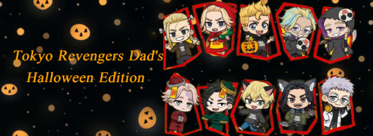

🎃Tokyo Revengers Dad's : Halloween edition 🎃 Ft: 20+ daddy's TW: none (unedited) Resident: @enchantedforest-network Photo: Tokyo Revengers x Tower Records Cafe

Taiju
-one of his kids would dress as a shark (tell me I’m wrong). When he sees them walking in front of them he could see the sale of the costume mimic like a shark's tail. -Would his kids trick or treat in the upper scale areas in Tokyo they get the good candy (the king size candy bars). -Would be the type to finish trick or treating early so it wouldn’t get too late.
Hanma
-Three kids dress them as lock, shock and barrel from the nightmare before Christmas. -Definitely cause mischief with his kids and teach them the fun of ding dong ditching or TP’ing someone's house if they didn’t give candy out. -Would pick some of the candies from his kids bucket but they would happily share with him
Chifuyu
-His child would be either a black cat or a witch and carry around a stuffed black cat. -Go with group friends and they all take their kids trick or treating. -Check his kids candy to make sure it is safe for them to eat.
Takemichi
-When his child said they want to be a superhero he goes all out for them, cape, mask even giving them a super cool hero name. -spend hours trick or treating till it gets every late. -His child would get tired and he would end up carrying them all the way home while they slept.
Kokonoi
-Wouldn’t settle for ordinary costumes would make sure his kids had the best costumes made out of the finest materials. -Throw a Halloween party with a big candy bar they kids would be in heaven. -Have a decorated wall so he could take pictures with his kids in there costumes
Ran
-would spend hours at the Halloween store trying to pick out the best costume for his kids. Enjoys every minute of it to see his baby's eyes light up with excitement. -One of the dads that would dress up with his kids. -Would rehearse with them and teach them how to say ‘trick or treat’
Rindou
-Kids would be some type of battle character either from mortal kombat or street fighters. -He has confidence his kids would win any kind of costume contest. -Scoping the competition on the kids costume contest give a smirk ‘my kiddo got this in the bag’ waiting for them to announce his kid was the winner of the costume contest.
Nahoya
-Twins he's gonna have one angel and one devil. IF one kiddo a little devil with a pitch fork. -Taking his kid trick or treating when there is a full bowl of candy left in front of the step no one is looking takes handful handy putting it into his littles one’s bag -Then he decided to empty the full bowl into his little one's bag and take off quickly.
Draken
-Taking his precious little one to the pumpkin patch to pick out a pumpkin. -When finding the perfect pumpkins they would crave them together but the pumpkin carving he would be the one carving them he wouldn't let his little one do it. -They would pick out the face then he would cut it out. -When taking out the seed from the inside he would see the gross yet funny look on his baby's face and laugh.
Mikey
-His baby would definitely be wearing a mini Toman uniform just like daddy would on Halloween. -He and his sibling would all take their kids trick or treating together. -Would start telling the kids which candy they wouldn’t like so when they give him that candy he secretly wanted those candies all along.
Hakkai
-Having a Halloween party knowing it may be a challenge for him to take his kids trick or treating due to him being recognized by fans. -If his kids are going to be a certain theme he would join them like the Adams family or the Munsters but have his own style in it. -All the desserts and foods would be themed all around Halloween like cupcakes that look like brains, drinks that would call witches brew, and spider cookies.
Mitsuya
-Would make his babies their costumes every year like the best daddy. His baby wanna be a ‘rainbow pony princess’ daddy got you. -Would let them know every time when they are trick or treating to say thank you after getting candy from the house they got it from. -would make sure they wouldn’t eat all the candy in one sitting and would give them one piece before bed.
Baji
-Baji would send photos to his mom with photos of the grandkid(s) and their costumes. -Would go to the same houses to get double the candy. -If they get home late from trick or treating he would make them some yakisoba noodles to eat
Kazutora
-Attend his littles ones' school Halloween parade record the whole entire parade. -If his little one is unable to take the steps at someone's house because the steps are too big he would pick them up and place them on the top step. -When they get home they would watch a Halloween special of his kids favorite show.
Shinichiro
-He and his kids decorate the house from head to toe with Halloween items. -If his babies wanted their face painted he would paint their faces and do a decent job on it. -The following day he would prank his kids about eating all their Halloween candy but when he sees them crying he would apologize and give them the candy.
Takeomi
-Would have enjoyed taking his kiddos out for Halloween festivities but when they get older the enjoy more of watching scary movies -Watching classic slasher movies, ordering food and buying the candy they want to eat. -he would also have a large bowl of candy when he gets trick or treating and give them handfuls of candy.
Wakasa
-if he sees his baby scared to go up to a house because the decorations are too scary he would go with them to make sure they are comfortable. - He would dress up like Dracula and his baby a little vampire he would tell them ‘let’s go my little bat’ -When his baby empties there bucket they would go through the candy and would randomly give him candies that they think he would like.
Arashi
-He sees a haunted house on first instinct ‘oh hell to the nooooo’ but if his kiddo wants to go in he has to put a brave face on. - He would be jumped scared a lot in the haunted house he would try to control his reflexes so he doesn’t knock anyone out -He admires that his child don't seem to be afraid of these types of things. Would go through every haunted house they wanted to for the night
Izana
-When practicing for the Halloween performance he would want it recorded so he could have memories of them when they were in their costume being so small. -He would enjoy making the sugar cookies with ghosts on them during this time of year. -Keep every Halloween costume because you don't have the heart to toss them, they hold valuable memories to him.
Sanzu
-Blog entire Oct month from when the kids find their costumes to the day it was Halloween. -Teach his kids ‘trick or treat that smells like my feet.’ -He and his kids would learn how to do Thriller or the monster mash dance.
Muto
-Kids would dress up in classic 50’s attire pompadours and leather jackets -Making sure the brush their teeth before bed to avoid cavities from the amount of candy they got -If the kids watched a scary movie he knew that they would be staying in his bed for the next few nights.
Kisaki
-If he missed trick or treating the way he would make it up to the kids is to take them to the store and let them pick out which candies they want. -That cart would be filled up in 0.5 seconds full of candy picked by his kids. -He would promise them that next year he will make sure he will be there with them so they can trick or treat together.
Kakucho
-If he saw his baby crying because they were took scared of a character or a person he would tell them ‘you have 5 seconds to leave or I will kick your ass for scaring my child’ -would cheer up his baby and make sure they won’t cry anymore let them don’t daddy wouldn't let anything happen to them. -Avoid homes that are too scary for his baby. He wants to make sure they have a great time.
Inui
-His kids love hearing him do scary stories and would make them think they are true on how he tells the story like the boogeyman. - if his kids doubt on of his stories he would hear like the wall/floors slightly creek and catch the kids attention then he would speak ‘they are listening to you.’ -Google how to make spooky snacks with the kids. He would enjoy creating snacks and eating them with the babies. The kitchen would be a mess.
Trunk or treat (all dad’s)
-If each man showed up with their kids they would have candy for days. -Big party for the kids to enjoy with a variety of things to do. -Each man would compete about who’s kid(s) the cutest. Because in their mind there are kids who are the cutest. -One big photo of all the kids together in their costumes even the older ones who aren't in costumes, because no matter how older they get those will still be there babies T^T

Interested in joining the taglist please fill out the form below to get a notification of your favorite characters when they are being posted! Link here ->taglist
Tagging: @the-haitani-baton, @satanlovesusall666, @galactict3a, @ratlovecat, @niko-ash, @iluv-ace, @captainmycaptainn, @strawberrychrome, @missgab, @anxious-chick, @livefromraleigh, @kei-b-gurlll, @spookiisopium, @bontensbabygirl, @txna04, @intheafterall, @stygianoir, @kira-rrh, @intheafterall, @staygoldsquatchling02, @nightqueensk, @alexanderlightwoodii, @ilovenats01, @sintyu, @missgab, @elmakimaki_ , @hana-patata, @thesleppybitch @ancient-vivarium
#tokyo revengers#tokyo rev headcanons#tokyo revengers daddy's#Halloween Edition#hanma shuji#matsuno chifuyu#draken#hakkai shiba#taiju shiba#kisaki tetta#izana kurokawa#kakucho hitto#mitsuya takashi#baji keisuke#hanagaki takemichi#kazutora hanemiya#wakasa imaushi#arashi#takeomi akashi#sanzu haruchiyo#shinichiro sano#mikey sano#ran haitani#rindou haitani
221 notes
·
View notes
Text
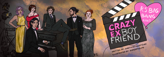
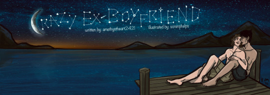
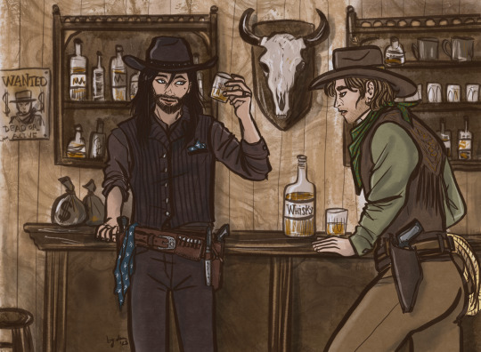
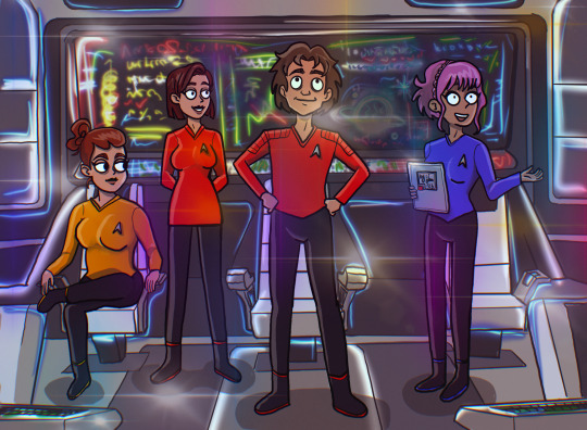
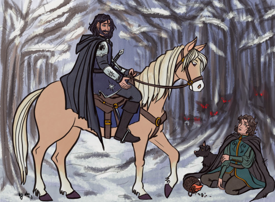
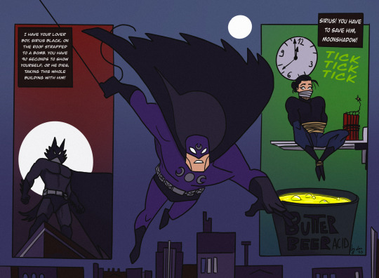

All the artwork I made for the fanfic Crazy Ex-Boyfriend by @amethystheart2421 for this year's @rsbigbang!
It was a wild run, we got paired up quite late due to our original pairs dropping out of the Bang, and even though it was already December and time was running thin, I decided to make this whole deal a way bigger challenge than it supposed to be... So I ended up drawing all 7 fantasy sequences, trying to mimic a different style for all of them, and finishing both versions of the banners I had in mind. I know, I know, but I swear even I wasn't aware that I am such an overachiever either!
Also, I usually like to hide little details as easter eggs on all of my artwork, so naturally this was the case with these too. I'm gonna list them one by one, also share a little story about each piece, sort of like a "directors cut werk", just so we stick to the screenplay motif. The numbers in brackets lists the order in which I drew the pictures.
The banners (1.,9.): I haven't watched Crazy Ex-Girlfriend the show, so I really had no idea about this whole thing, hence my initial idea of re-drawing one of the official promo posters of the show as the banner. But then Nicole shared the first scene with me when we got paired up, and also told me that her original artist wanted to draw the stargazing scene, which I also really liked. I sketched out both versions to see which one would look better, and also to warm up a bit for this version of the characters. (Nicole also shared some faceclaims, so except Sirius' and Lily's design, I tried to stick to her vision as much as I could.) The Netflix poster was considered the final one for quite a while. The stargazing banner was the last piece of artwork I finished, which I also edited to be used as Chapter dividers. I liked the idea so much I actually referenced the starry sky on the other pictures too. On the Netflix banner, Remus' socks and Sirius' suit handkerchief (how do you call those things in English, gahh) both have the starry pattern.
The western (3.): By this time it was decided that I'd do all fantasy sequences in a different art style, but I couldn't really come up with any specific style which could have fit the western vibes, so the characters are drawn in my own usual style, only the colouring is different. I tried to go for a sepia effect, without using a filter, I think I could pull it off well enough. I was considering to draw Sirius as a Native American for this, because I just don't see him as Caucasian in general, and also, Black Dog sounds like a badly translated indigenous name... But I discarded this idea for the sake of "historical accuracy" (and to save time, haha), as I think they wouldn't visit a saloon this way. I added the starry sky pattern to Sirius' handkerchief and... scarf? (I really should learn how certain textil items are called in English...) There is a wanted poster in the background with Voldy. And I swear I didn't mean to draw Remus looking this horny, it just kinda happened by accident! He is sure VERY fascinated by Sirius'... pistol.😜
The Star Trek (6.): My original idea was to draw like usual and just add so many lensflares to the picture that it's not visible if I copied another style or not. But in the meantime I started to watch Star Trek: Strange New Worlds with my bf and also found out that there is a new cartoon too, so it was then settled. This style is very different from my own, but it was so much fun! It was weird not to draw every single strand of hair in excruciating detail, actually that was the hardest part, haha! I struggled a bit with the placement of the lensflares too, the first version had too many and too bright, it had a disco vibe rather than a spaceship. I wanted to add easter eggs to the background screen, but I was running out of time, so there's only one light blue star similar on the screen! Also now I know that the uniform colors are not really consistent in Star Trek, and Remus’ might have had to be gold as Captain…🤷🏻♀️
The Disney (2.): This one sparked the first idea in my head after I read all fantasy scenes Nicole kindly shared with me. When I first sketched this, I still had no idea that I will end up drawing for every chapter and the style copying was not settled either. It started with this piece, I had the vision of the wolf chasing scene from Beauty and the Beast, and we were discussing whether it's plausible to collect berries during the winter or not... I've tried to make the final piece look as classic Disney as I can, and since I could pull it off, it was not a question anymore whether I'd try to do this with other styles for the other scenes. Retrospectively, this one was the easiest to make, apparently my usual style is not that far from Disney (I grew up watching those movies, so it's not a surprise), but I had to really focus on drawing the animals, it's been ages since I last drew any! (The trick is to give them eyebrows, and bam, it's Disney style!) Sirius' armour, clothes and sword has the star, and I also designed his own "crest" with the black dog and a star on his shoulder plate. The whole concept of the picture is Sirius' side being very bright coloured, while Remus' with the scary wolves in the background being very dark. This might have worked better if it was not set in the winter, but I wanted to stick to the Beauty and the Beast vision I had.
The Comicbook (4.): I was very excited for this one, I really like the looks of the old Batman the animated series, and the way some of his comics are drawn. It's such a unique style, I really like the simple shapes and bold contrasts. Well, it turned out I am very bad at this! I struggled quite a bit trying to capture what I had in mind, but I couldn't even come close to it... So I kinda cheated a bit because I just traced the lineart directly from the reference pictures of Batman comic books I found online. I tried to make Remus less buff, but it looked very weird, so I let him keep his muscular Batman body instead. I drew the wolf mask and the whole Sirius panel, and the coloring went smoothly after I finalized the lineart, even though I only realized that I switched the colour schemes of Remus' superhero outfit when I looked up the quotes for the comic panels, oops. Overall I like how it looks, but I am not that proud of it as I had to "cheat".
The Hobbit (5.): I've probably spent the most time with this one! I actually really like Martin Freeman as an older Remus FC, so I was quite excited to do this piece. My original idea was to mimic John Howe's style, as he is the Tolkien illustrator god, but his level of skill and mine are very very far from each other... and as I struggled a lot with the Batman piece, I felt like going for a smaller challenge. That's why I decided to have a go at Alphonse Mucha's art nouveau style. Turned out it was the worst possible idea! 🤣 The whole point of art nouveau is depicting attractive ladies in an ethereal way... But if you switch the ladies with a fat hobbit, the vibe def won't be the same! The first version just looks so extremely absurd, it's both awful and hilarious. By the time I could fix the pose so it wouldn't look as ridiculous, the final style looked nothing like art nouveau... I still have no idea what style it is now, not my own or any of the ones I tried to capture, that's for sure. I considered adding the star pattern to that tablecloth, but I decided that the lupin flowers in the foreground and the whomping willow-like tree are enough reference for this pic! I like how it turned out in the end tho, I think I could do justice for the watercolor-looking coloring technique, and the end result looks a bit like a fancier version of old children's book illustrations... Which is essentially what The Hobbit is, so it all sorted itself out by the end.
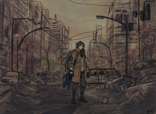
The Anime (7.): I like anime (I'm a little picky about them tho), so it was not a question that I would give this style a try! I am a huge fan of cyberpunk (the genre), so initially wanted to do that, I'm such a slut for Ghost in the Shell and I really like the aesthetics of the Akira posters, but after reading the actual scene, it was not really fitting. So I saved the cyberpunk AU for later, and went for the post-apocalyptic vibe instead. Obviously anime had a great influence on my art style, so similar to the Disney one, it was not that much of a challenge to mimic it. However I'm not that good at drawing backgrounds, and oh boy, I really made myself get over this obstacle with this series of pictures! Also as I was more comfortable with this piece, I actually added the starry sky pattern from the beginning to the scarf/blanket Remus has on this picture!
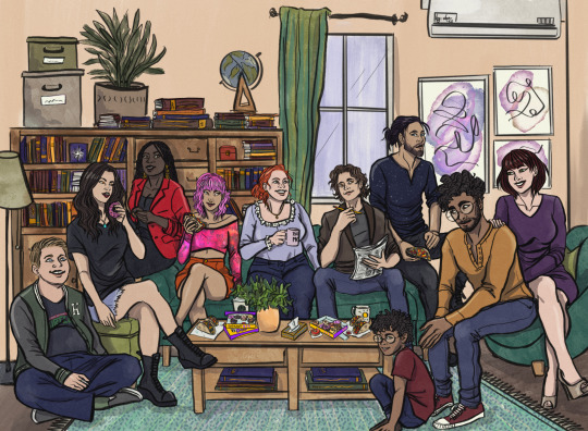
The Sitcom (8.): The original idea was to copy Hanna Barbera's old family cartoons' style, but as my deadline was very close and after reading the scene I realized that it will have a shitton of characters, I quickly abandoned my original plan. So this one is drawn in my own style, sort of, the designs of the characters are more aligned with Nicole's vision (sans Sirius, Lily, and partly Peter). The hardest part was definitely to figure out how I could fit 10 characters into one picture, let alone sitting in a living room! Also, I had to actually draw the living room too, considering perspective and scaling... Something I am not that good at. In the end the coffee table is maybe a little too big, but I needed that to hide the legs of the characters sitting on the sofa, haha! Also, the sofa is the Millennial Dark Green Velvet Sofa, because I also want to have one and it really emphasizes the general existential dread! (Just kidding.) Also also, I just realized that I have no idea how to eat tacos without making a mess (they are not that popular where I live). I added the starry sky pattern to Sirius' shirt, and gave a Teenage Mutant Ninja Turtles T-shirt to Peter, as he is talking about that in the scene. I wanted to squeeze in further references to the newspaper Remus is holding, but it was too tiny. The star from Knight Sirius' armour is in the background on the bookshelf. Also that globe just makes no sense but I had no better idea how to fill the empty space 😅. Molly is holding a mug with "BEST MOM" written on it, and I intentionally made Marlene's eye colour the same as Remus', who btw should have worn a bathrobe according to the original scene, but it was too late to fix that by the time I realized it. All in all, I am quite satisfied with how it turned out, it has the necessary sitcom vibes. And it is kinda a record for me in terms of number of characters drawn (the most was 12, but that one has no background, so I'd call it a tie!)!! I am very proud of myself for pulling this piece off, it really is the achievement of the year!
TLDR; (I mean really, my rambling is just too long!) I am happy that I was paired up with Nicole, working with her was such a creative process! My absolute favourite thing to do is work on AUs, and she has provided me with the opportunity to do so, I am grateful! It was truly a pleasure to participate in this (even if it's not that clear from all the complaining I just had above, haha)! If you ask me nicely I might show you the cursed first version of the hobbit picture!
#r/s big bang#wolfstar#sirius black#remus lupin#regulus black#james potter#lily evans#nymphadora tonks#molly weasley#peter pettigrew#harry potter#marlene mckinnon#dorcas meadowes#crazy ex girlfriend#lotr au#cowboy au#disney au#star trek au#anime au#sitcom au#batman au#fanart#art by lau#lau draws with a tablet#collaboration#marauders#amethystheart2421
69 notes
·
View notes